
Turn your wrist over and look at the veins in daylight. Summer nail colors, Blue or purple means cool undertones. Green means warm. A mix means neutral, and neutral wears almost anything.
That check explains why a polish can look incredible in the bottle and dead on your hand. It holds no matter how fair or deep your skin is, since two people with identical skin depth can have opposite undertones and need completely different colors.
| Your undertone | Summer shades that work |
|---|---|
| Cool | Blue-based red, fuchsia, lavender, navy, mint |
| Warm | Orange-based red, coral, peach, lemon yellow, gold |
| Neutral | Most things, plus true red and pink-beige nudes |
Metallics are the exception. Gold and silver make their own contrast through shine instead of pigment, so they land on everybody. Sheer and jelly finishes do something similar, reading differently on each person who wears them.
1. Classic Red
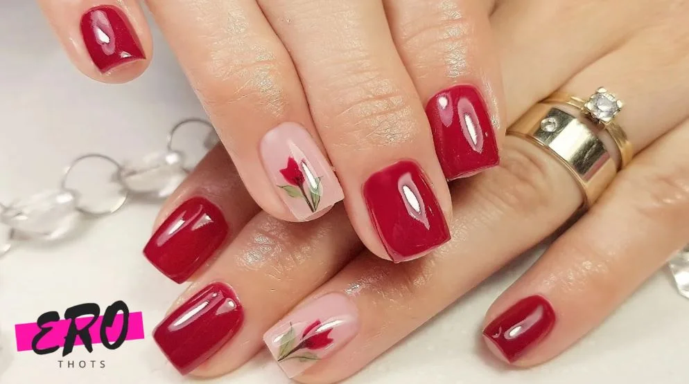
Why Red is a Timeless Summer Shade?
Red works all year, though a vivid red in July feels different than the same bottle does in February. There’s a retro quality to it that suits vintage sundresses and classic swimwear equally, and a red manicure pulls a look together even when nothing else in the outfit is doing much.
How to Wear Red Nails?
Undertone matters more here than anywhere else on this list. Blue-based red if you’re cool, orange-based red if you’re warm. Same color family, very different results.
Bright true red for daytime, deeper burgundy after dark. It looks good on toes too.
Keep everything else quiet with neutral tones if you want the nails to lead, or put it against another strong color if you like a bit of clash.
2. Coral Crush
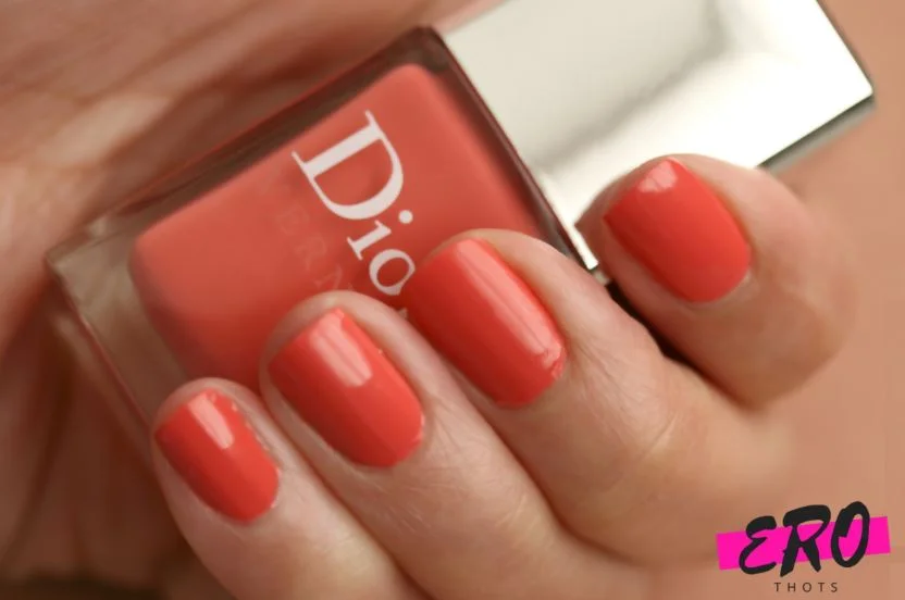
The Appeal of Coral for Summer
Coral is red for anyone who finds red a bit much. Pink-orange, warm, and it does something specific against skin that’s caught some sun. It’s the best pedicure color on this list, particularly with anything strappy.
Coral Shade Recommendations
There’s no such thing as one coral. Some lean pink, some orange, some peach, and which one suits you comes down to undertone more than how light or deep your skin is.
Pink corals for cool. Tangerine and peachy corals for warm. Deep corals carrying red in them look excellent against deeper skin whichever way your undertone runs. If you have fair skin that runs cool, the pink corals will read much cleaner than the orange ones.
3. Peachy Keen
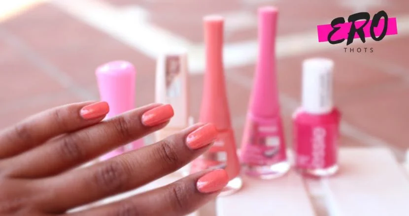
Peach as a Softer Alternative to Orange
Peach is orange with the volume turned down. Warm and mellow, without the commitment a true orange asks for.
It works best on warm undertones for a simple reason, which is that it’s essentially a diluted version of the golden tones already sitting in that skin, so it harmonizes instead of competing.
Complementary Colors for Peach Nails
Sea foam or turquoise next to peach gives you a beachy color-block. Peach and lavender together is soft and easy to wear. For something more tropical, bring bright pink or coral in on an accent nail, and a bit of shimmery gold tips the whole thing toward glam.
4. Pretty in Pink
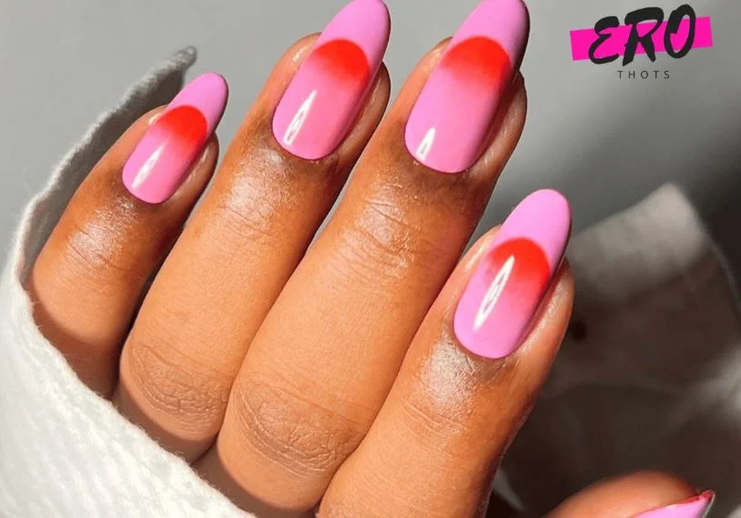
Different Pink Tones for Summer
Pink covers more ground than anything else here.
Magenta and electric pink feel current. Bubblegum pinks swing retro or modern depending on what you do with them, and a sheer pink-tinted gloss gives you almost nothing, which is sometimes what you want.
Cool undertones want fuchsia and berry. Warm undertones want the pinks with peach hiding in them.
Pairing Pink With Other Colors
Against white or navy it reads crisp and preppy. With other pinks, blush through fuchsia, you get a tonal look that takes more thought than it appears to. Faded denim knocks it casual, black or gray accents toughen it up, and hot pink with lemon and lime gives you a citrus color-block that only really works in summer.
5. Lavender Fields
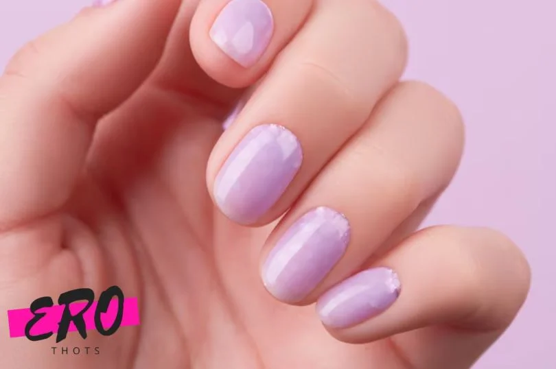
Lavender as an Unexpected Summer Choice
Nobody reaches for lavender in July, and more people should.
Soft purple, delicate and understated, and a real break from brights once you’ve had enough of them. It’s cool-toned, so cool undertones get the cleanest result, though it looks particularly striking against deeper skin.
Lavender Nail Art Ideas
Floral designs suit lavender better than they suit anything else. Sprigs of blooms, abstract petals, whatever your tech can manage at that scale.
Dove gray or pale olive alongside it reads elegant. A lavender ombré fading to white is soft enough for a wedding. A matte topcoat updates it, and negative space with glitter accents gives the eye more to do.
6. Minty Fresh
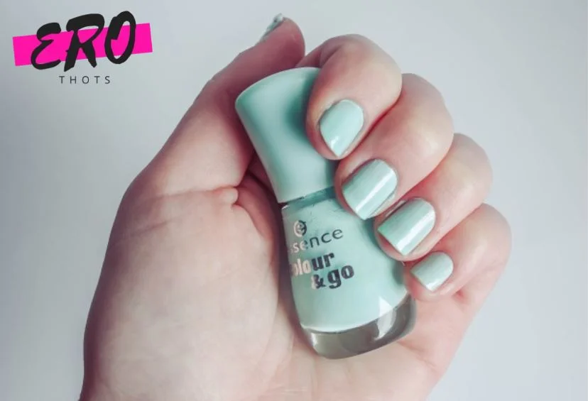
The Refreshing Look of Mint
Mint sits cool and crisp on the nail with an almost frosted finish.
It’s more subdued than other greens, which is why it’s one of the few near-bright colors that still passes in a conservative office. Cool undertones get the most from it, though it’s forgiving enough that most people can wear it.
Mint Green Nail Inspirations
Glossy opaque mint on fingers or toes. A shimmer version if you want it playful. Mint takes retro designs beautifully, polka dots and gingham especially. Blend it into white or pale yellow for an easy ombré, or mix it with other pastels across all ten.
7. Lemon Drop Yellow
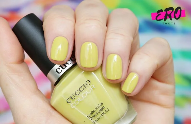
Yellow as a Trending Summer Color
Yellow is having a moment across summer fashion, and a zesty lemon on the nails lifts everything around it. It’s warm-toned, so warm undertones carry it easiest, and it’s the shade most likely to improve your mood every time you glance down.
Tips for Pulling Off Yellow Nails
Nervous about it? Start pastel, or start sheer.
Use it on one nail instead of ten. A yellow French tip is wearable in a way a full yellow set isn’t for everybody, and easing into a color is a perfectly reasonable approach.
White, beige or dove gray alongside lets it carry the look. Emerald green or periwinkle blue makes it louder.
8. Ocean Blue
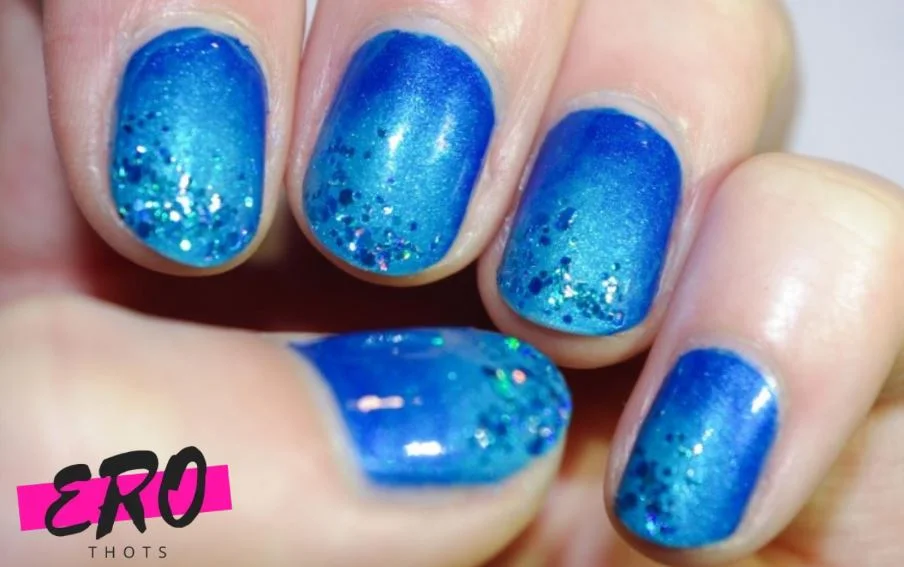
Capturing Beach Vibes With Blue Nails
Navy, cobalt and sapphire seem like odd summer choices and they work anyway. These deeper blues have weight without heaviness, they suit every nail length, and navy in particular is about as universal as a color gets. Cool undertones benefit most.
Ombre and Gradient Blue Designs
Light-to-dark ombré is the obvious ocean reference and it’s still the best one. Sky blue or aqua at the base, through azure, into midnight at the tips.
Reverse it for a half-moon effect. Gradients across several blues build depth, and a shimmery pearl or turquoise worked in adds another dimension.
9. Bright White
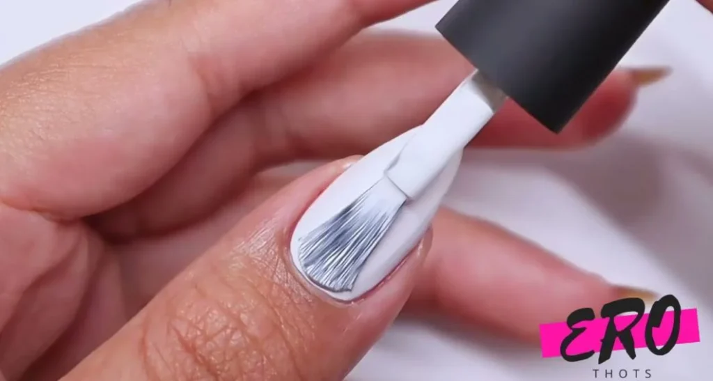
White Nails For a Clean Summer Look
Opaque white makes your hands look more tan than they are, which is most of why it’s a summer staple.
It’s minimal, works on any nail length or shape, pops against every skin tone, and doubles as a base for almost any nail art you’d want on top.
Mixing White With Other Summer Shades
White earns its place as a support color more than a main event. Flower decals or fruit stickers over it. White squiggles on a neon base. A dotted French with white tips. Color-blocked against an equally opaque pastel. Layering sheer jelly colors over white also gives you a translucent effect that won’t happen over any other base.
10. Glittery Golds
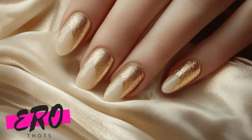
Adding Sparkle With Gold Polish
Gold glitter catches sunlight in a way nothing else here does.
A fine glitter-packed formula gives you opaque metallic. A sheer buildable one with sparse flecks gives you a suggestion of sparkle. Both work, they’re just different products.
Gold is also the one shade where you can skip the undertone check, since metallics build contrast through shine instead of pigment.
Glitter Accent Nail Ideas
One accent nail is the way in if full glitter feels like too much. Solid gold on the ring fingers over a nude base. A thin gold stripe down the center of each nail. Chunky glitter on the tips for a sparkling French. Gold mixed with rose gold and silver for maximum shine, and there’s no shortage of nail art designs built around exactly that.
Test the Shade Against Your Wrist, Not the Bottle
Colors shift dramatically between store fluorescents and daylight, and the bottle you fell for under shop lighting is usually the one that ends up unused in a drawer.
Hold the swatch against the inside of your wrist instead of the back of your hand, since the inner wrist sits closer to the undertone you’re matching.
And use a base coat. It changes how the color sits and keeps the shade truer to what you saw in the bottle, which matters most with the vibrant options on this list, since brights are the ones that stain and shift.