
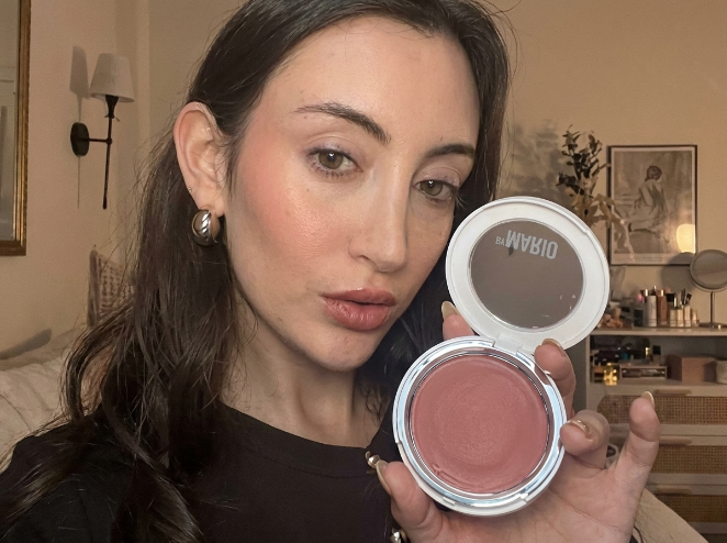
Best blush for pale skin isn’t one thing though, and a shade that sits beautifully on porcelain with blue veins under it will go muddy on fair olive, so the rest of this sorts out which is which.
- Cool undertones: soft pink, dusty rose, mauve.
- Warm undertones: peach, coral, apricot.
- Neutral: most of both.
- Fair olive: warm rose or muted terracotta.
Undertones in Pale Skin
Daylight, inside of your wrist, look at the veins.
- Blue or purple veins, cool. Silver jewelry suits you.
- Green veins, warm. Gold suits you.
- Can’t tell, neutral. Easiest one to have.
Fair skin quite often reads cool at the wrist and then behaves warm on the face, and fair olive does this constantly, showing blue veins and still needing a warm blush, which is why so many people who followed the vein test end up with a drawer of pinks that never looked right on them.
People with neutral undertones run into the same thing from the other direction, describing themselves as leaning slightly warm one month and slightly cool the next, and the forum threads on it go on for pages. Which tells you how loose these categories really are.
Swatch on your jaw instead, in daylight. Not the back of your hand.
The wrong undertone announces itself inside half a minute. It goes slightly gray, or slightly orange. The right one just looks like you.
Powder vs. Cream Blush: Which is Best for Pale Skin?
| Powder | Cream | |
|---|---|---|
| Best for | Oily, combination | Dry, normal |
| Finish | Soft, sets the face | Sinks in, looks like real flush |
| Difficulty | Forgiving, builds in small steps | Needs a steadier hand |
| Fails when | Skin is dry or flaky | Weather is hot and humid |
New to blush? Powder. It’s easier to control and easier to add to a little at a time, which is what fair skin needs. It also does double duty if you have oily skin, since it absorbs some of what surfaces through the day.
Cream is the one that reads closest to real blood flow on pale complexions. Fingers work fine, and the warmth helps it move.
One thing that catches people out seasonally: cream slides in summer humidity, powder can look dry over winter skin. If your usual one stops behaving in July, that’s why, not the product.
Top Shades to Complement Cool Undertones
| Shade | What it does | Reach for it when |
|---|---|---|
| Soft ballet pink | Mimics the flush of a cold morning | Everyday, under any lip color |
| Dusty rose | A little more depth, still quiet | Pale pink disappears on you |
| Muted mauve | Adds dimension without much color | Morning through evening, no change needed |
| Berry or plum | Real color, high risk | You want impact and the formula is sheer |
Berry is the one that goes wrong.
On very fair cool skin it can look wonderful and it can also look like somebody hit you, and the whole difference sits in how much pigment the formula is carrying. Buy a sheer one. You can build a sheer berry up over two or three passes, but getting a heavily pigmented one back down once it’s on your cheek is a different afternoon entirely.
Avoid orange-based corals here. They go muddy against cool skin.
Top Shades to Complement Warm Undertones
- Soft peach is the everyday one. Warms the face without the hard contrast a cool pink creates on fair skin.
- Light coral for summer. Takes a light bronzer alongside it if you want some shape.
- Apricot sits between pink and orange. Useful when you read warm but only barely.
- Warm rose and muted terracotta are for fair olive skin, which most of these charts skip entirely. They cut through the faint green cast olive carries. Cool pastels on olive go ashy inside an hour.
- Skip blue-toned pinks. On warm fair skin they read as bruising.
Redness changes the shade you should pick
Plenty of very fair skin comes with redness already in place. Around the nose, over the chin, high on the cheeks. Sometimes that’s rosacea and sometimes it’s skin that flushes at nothing in particular.
Redness, sun spots and general patchiness all read louder on a delicate skin tone than they do on deeper complexions, which is part of why shade choice gets fussier at this end of the range.
Standard advice sends this person straight to cool pink. Blue veins, cool undertone, pink blush.
But pink over existing pink just turns the volume up on the redness, and the face ends up looking flushed instead of lit, which is the opposite of the job blush is supposed to be doing.
Go peach or apricot even when your undertone reads cool. The yellow underneath does some quiet correcting against the red. It breaks the undertone rule on paper and it works on a face.
Cream over powder as well, if the redness comes with dryness. It usually does. Powder finds every flaky patch and points at it.
Application Techniques for a Natural Flush
Fair skin shows about twice as much of the same product, because blush gets formulated for the middle of the tone range, not the ends of it.
- Tap the brush, then tap it again. One that looks nearly clean still has plenty on it.
- Warm cream on the back of your hand first. Straight from the pot gives you a fingerprint of color instead of a wash.
- Fluffy tapered brush, not a dense flat one. Dense brushes deposit pigment, fluffy ones spread it out.
- Apples for round and young, cheekbone for lift. Pick one.
- Stop outside a line dropped from the outer corner of your eye. Any closer to the nose and it reads as sunburn.
- Check it in daylight before you leave. Bathroom bulbs run warm and flatter blush.
Overdone it? Press a clean powder brush over the area, or dab with a damp sponge. Don’t rub. Rubbing spreads the color sideways and takes your foundation with it.
Tips for Longevity
It fades from the middle of the cheek first. That’s the part of your face that moves most and the part you touch without noticing.
- Primer, if fading keeps happening.
- A light foundation or tinted moisturizer so the powder has something to grip. Bare moisturized skin is slippery.
- Cream underneath, powder in a related shade on top. The cream anchors, the powder locks.
- Setting spray at the end instead of translucent powder, which can go chalky over blush.
Still fading by three? That isn’t a technique problem. Keep the compact in your bag.
Common Mistakes to Avoid
- Shade too dark or too pigmented. The big one. Accounts for most of the “blush doesn’t suit me” conclusions people reach.
- Taking it too far toward the nose. Throws the balance of the whole face.
- Skipping the blend. Unblended edges show far more on fair skin than on medium or deep.
- Judging color on the back of your hand. Different tone, different texture. Jaw, daylight.
- Powder over an unprepped dry patch. Guarantees the patch is the first thing anyone notices.
Recommended Products and Brands
NARS Blush in Orgasm is the reference point everyone compares against. Peachy pink, fine gold shimmer, around thirty dollars.
Check this before you repurchase, though. NARS has reimagined the powder blush line, now running 34 shades with a four-pigment blend and claimed wear up to sixteen hours, and longtime users have reported the new Orgasm coming out less shimmery and more peach than the version they knew. If you’ve had the same compact for years, don’t assume it’s a straight swap.
- NARS Deep Throat is the softer pink from that line. Better on cool fair skin than Orgasm.
- Milani Baked Blush in Luminoso is the drugstore comparison. Swatches show it running peachier than Orgasm, which on very fair skin is often the advantage.
- Clinique Cheek Pop goes on sheer and builds. The behavior you want.
- Maybelline Fit Me is the cheap way to test an undertone theory before spending thirty dollars finding out you were wrong.
- Glossier Cloud Paint for a barely-there cream finish. Reviewers keep noting how much color comes from very little, so tap it out.
Combining Blush with Highlighter and Bronzer
A champagne or pearl-toned highlighter reads most natural on very fair skin, since gold can pull yellow. Tops of the cheekbones, bridge of the nose, cupid’s bow.
Bronzer needs more thought. One or two shades deeper than you are, no further, and cool or neutral in tone, because warm bronzers turn orange on fair skin fast.
Under the cheekbone and along the jaw, with blush sitting above it. The two shouldn’t overlap.
Creating a Unified Makeup Look
Pale skin shows contrast sharply, so the pieces have to agree.
| Cheek | Lip | Eyes |
|---|---|---|
| Cool pink | Rosy pink | Neutral browns, taupes |
| Peach or coral | Warm nude, soft coral | Soft bronze |
| Berry | Muted rose | Keep it bare |
A cool pink cheek with a rosy pink lipstick is the safest pairing of the three, because both sit at the same temperature and neither has to work around the other.
Same temperature on the cheek and the lip and the face reads deliberate. Put a cool cheek with a warm lip and something looks slightly off, though most people won’t be able to tell you what.