
But when you’re indie, you put most of your energy into the website, the social pages, the photography and the posting schedule when you’re trying to get noticed, and that is not wrong.
But think about the brands you know by sight. Half the time it’s small things, a color they repeat so often you recognize it, how their packages look when they come to the door, a prop you notice in every photo they share on social media.
Any one of those looks like nothing on its own. Stretched across eighteen months in a crowded feed, they end up being what people recognize you by.
Why Small Details Are Easier to Remember
Nobody remembers a full caption. They don’t remember your long product description, and they don’t remember the offer you made three weeks ago.
You remember things like a pink mailer, a red page, a blank label in black and white, some icon or phrase that keeps turning up in the corner of things. And all of that takes no effort at all to process.
I think the interesting part is all that information popping up in more than one place, they see a photo on Instagram, a week later they get a package and, a month later, they end up on your website. But if the colors and the tone feel like they belong together across the three, then you’ve become recognizable, and that’s a different thing from simply being seen a lot.
And there’s no big budget in any of it. You pick a couple of details and you use them.
Start With a Clear Visual Direction
Two main colors, one accent color, a few words describing the mood. That’s enough to start with, and beats deciding from scratch every time.
For example, if you’re selling handmade jewelry, you may want your brand to feel delicate and personal. If you’re a fitness creator, maybe energetic and clean. Either way you’ve now got something to check your decisions against.
What background is in your product photos? What color are your thank-you cards? Is it playful? Minimalist? Classic? Bold?
All of those ideas have a direction so it doesn’t seem like they’re random, and it’s easier to reject bad designs.
Make Packaging Part of the Experience
If brand personality is to be found anywhere, packaging is the easiest place to look and the first point of contact for many online retailers.
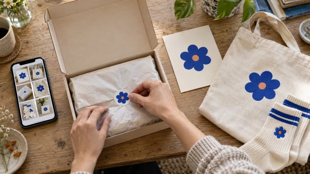
This doesn’t need to be expensive packaging; a sticker, a piece of tissue paper printed with your logo, the way you organize the products within the box, changes how somebody feels when they first receive it.
For instance, a skincare company could use muted colors and clean packaging with a small card that provides instructions on its use; an art shop could use brightly colored stickers, a doodled letter and a colorful postcard.
You’re trying to get that one little moment to read as considered, and packing them in is counterproductive.
Merchandise as a Brand Reminder
Merch works when it feels tied into the brand rather than bolted on. Anything people wear or keep, and you have them holding on to your brand experience beyond that first transaction. That’s why tote bags, pins, hats, stickers and socks are popular. Once you put your statement or your pattern or your character on a little piece of something, it’s yours.
For creators who want to create merchandise that is not as formal as a shirt or hoodie, custom socks can be another subtle detail of their brand. This is because socks can often be made in colors, patterns, illustrations, or graphics that creators have previously included in their content.
Whether it works comes down to how well they hit their brand notes: a wellness account trends toward a calm pattern and soft colors; a comedy-focused creator puts a running joke or character in there; and coffee brands nearly always end up with an illustrated cup or bean or a slogan somewhere.
Get that part right, and the item stops reading as promotional and starts to read as something from inside the community rather than something sold to it.
Photograph Moments; Don’t Force Them
Online brands live on visuals, so think about how the physical details are going to look on camera before you order any of them.
A branded coffee mug on a desk, a color-coordinated package in an unboxing video, or a piece of small merchandise in the background of a behind the scenes video shouldn’t distract the viewer from the main focus. It just sits there supporting the overall feel.
Build a small collection of brand props that you can use over and over again, like a backdrop, a tray, a notebook, one piece of merch. People start to associate those things with your world without you ever having to tell them.
And none of it turns your feed into a sales feed. The brand details just show up in ordinary content.
The Customer or Follower Comes First
A decorative card gets whatever extra value there is in giving care instructions, a discount for next time, or a few words of personal connection. A sticker gets used if the design is something people would stick on a laptop without thinking twice about it.
And merch works the same way. If it’s uncomfortable, badly designed or doesn’t connect with your audience’s taste, it won’t do what you hoped, no matter how good the idea seemed. Reflect the community’s humor or style and it becomes something people want to keep.
Before you make any branded item, ask yourself these questions:
- Would my audience use this?
- Does it match the tone of my brand?
- Will this still make sense six months from now?
- Can it be photographed or shared naturally?
These keep the focus on connection, as opposed to clutter.
Be Uniform But Allow for Future Expansion
It doesn’t mean we never change. We just have to change with intent.
You’ll update colors as the work grows, refresh the packaging, bring in new merch. What keeps all of that coherent is holding onto a recognizable thread through it, whether that’s a tone of voice, a visual symbol, a color family or a type of message you keep coming back to.
Seasons can also come in the form of limited packaging for a holiday event, a special palette for a campaign, or even a small piece of merchandise for a new project.
Having a flexible identity allows you to experiment without confusing those who have followed you.
Don’t Include Irrelevant Detail Just for Detail’s Sake
Not every brand needs every possible touchpoint. Too many details get overwhelming and they get expensive to maintain.
One creator’s signature style is a color palette, a thank you note and a single piece of merch. Another creator builds an aesthetic based on what the package looks like, how they style the photos, and the handwritten note inside. Three things done properly will usually carry more weight than eight done at seventy percent.
What’s right depends on your brand, your audience and your budget. In other words, everything has to earn its place.
If that doesn’t support the customer experience or make you easier to recognize, it probably doesn’t deserve to be there.
What People Remember Six Months Later
It won’t be the logo, and it won’t be the website however polished you got it.
What sticks is the repeated stuff, the packaging and the colors and the photo props and the notes and the things people could wear out of the house. Small choices that carried more weight than they looked like they would.
In other words, the details that do this best tend to be the quiet ones: feel natural and useful and connected to whoever made them, and used with care they turn a single interaction into something somebody still recognizes months later.